Data visualization plays a crucial role in understanding statistical distributions. One of the most commonly encountered distributions in statistics and data science is the Normal Distribution, often referred to as the Gaussian Distribution or the Bell Curve.
In this tutorial, you’ll learn how to visualize a Normal Distribution plot using Plotly, one of the most popular Python libraries for creating interactive visualizations.
What Is a Normal Distribution?
A normal distribution is a probability distribution characterized by:
- A symmetrical bell-shaped curve
- Mean, median, and mode located at the center
- Most values concentrated around the mean
- Tails that extend infinitely in both directions
Normal distributions appear frequently in real-world scenarios such as:
- Exam scores
- Heights and weights
- Manufacturing measurements
- Financial returns
- Sensor readings
The probability density function (PDF) of a normal distribution is:
Where:
- μ = Mean
- σ = Standard Deviation
Why Use Plotly?
Plotly offers several advantages over traditional plotting libraries:
- Interactive charts
- Zoom and pan capabilities
- Hover tooltips
- Easy customization
- Web-friendly visualizations
- Export to HTML
These features make Plotly an excellent choice for exploratory data analysis and dashboard development.
Installing Required Libraries
First, install the required packages:
pip install plotly numpy scipy
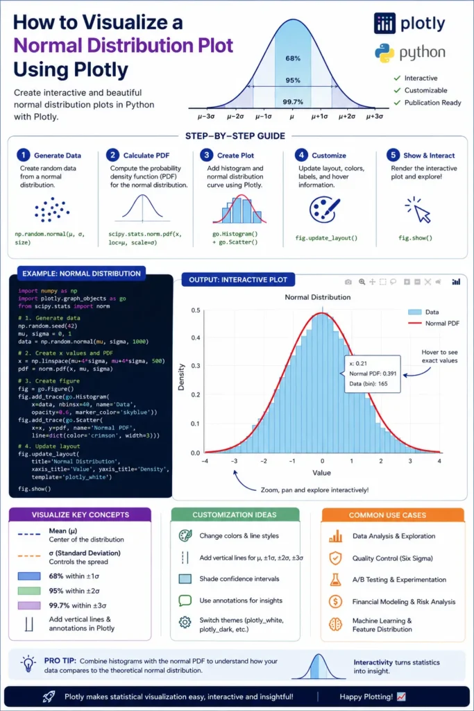
Generating a Normal Distribution Curve
Let’s create a standard normal distribution with a mean of 0 and a standard deviation of 1.
Step 1: Import Libraries
import numpy as np
import plotly.graph_objects as go
from scipy.stats import norm
Step 2: Generate Data Points
mean = 0
std_dev = 1

x = np.linspace(-4, 4, 1000)
y = norm.pdf(x, mean, std_dev)
Step 3: Create the Plot
fig = go.Figure()
fig.add_trace(
go.Scatter(
x=x,
y=y,
mode='lines',
name='Normal Distribution'
)
)
fig.update_layout(
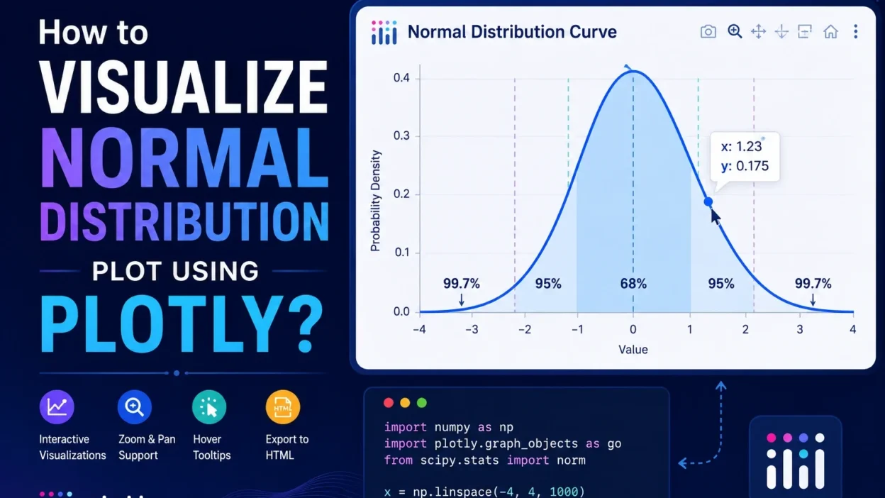
title='Normal Distribution Curve',
xaxis_title='Value',
yaxis_title='Probability Density',
template='plotly_white'
)
fig.show()
Expected Shape of the Distribution
The resulting curve will look similar to this:
The peak occurs at the mean, and the distribution decreases symmetrically on both sides.
Visualizing Different Means and Standard Deviations
You can compare multiple normal distributions in a single chart.
import numpy as np
import plotly.graph_objects as go
from scipy.stats import norm

x = np.linspace(-10, 10, 1000)

fig = go.Figure()

fig.add_trace(
    go.Scatter(
        x=x,
        y=norm.pdf(x, 0, 1),
        mode='lines',
        name='μ=0, σ=1'
    )
)

fig.add_trace(
    go.Scatter(
        x=x,
        y=norm.pdf(x, 2, 1.5),
        mode='lines',
        name='μ=2, σ=1.5'
    )
)

fig.add_trace(
    go.Scatter(
        x=x,
        y=norm.pdf(x, -2, 0.5),
        mode='lines',
        name='μ=-2, σ=0.5'
    )
)

fig.update_layout(
    title='Comparison of Normal Distributions',
    xaxis_title='Value',
    yaxis_title='Density'
)

fig.show()
This visualization helps demonstrate how:
- Changing the mean shifts the curve horizontally.
- Increasing standard deviation widens the curve.
- Decreasing standard deviation creates a narrower peak.
Creating a Histogram with a Normal Distribution Overlay
In many real-world datasets, you’ll want to compare actual observations against the theoretical normal distribution.
import numpy as np
import plotly.figure_factory as ff

data = np.random.normal(0, 1, 1000)

fig = ff.create_distplot(
    [data],
    ['Sample Data'],
    show_hist=True,
    show_curve=True
)

fig.update_layout(
    title='Histogram with Normal Distribution Curve'
)

fig.show()
This approach is useful for:
- Data quality analysis
- Distribution testing
- Exploratory data analysis (EDA)
- Machine learning preprocessing
Customizing the Plot
Plotly allows extensive customization.
Change Line Color
go.Scatter(
    x=x,
    y=y,
    mode='lines',
    line=dict(color='royalblue', width=3)
)
Add Mean Marker
fig.add_vline(
    x=mean,
    line_dash="dash",
    annotation_text="Mean"
)
Add Shaded Confidence Intervals
fig.add_vrect(
    x0=-1,
    x1=1,
    fillcolor="lightblue",
    opacity=0.3
)
These enhancements improve readability and highlight important statistical regions.
Practical Applications
Normal distribution plots are widely used in:
Data Science
- Feature analysis
- Outlier detection
- Data preprocessing
Finance
- Stock return analysis
- Risk modeling
- Portfolio optimization
Manufacturing
- Quality control
- Process capability analysis
Research
- Experimental measurements
- Survey analysis
- Statistical inference
Infographic
Conclusion
Plotly makes it easy to create interactive and visually appealing normal distribution plots in Python. By combining NumPy, SciPy, and Plotly, you can generate bell curves, compare distributions, overlay histograms, and build rich analytical dashboards.
Whether you’re a data scientist, analyst, researcher, or student, mastering normal distribution visualization is an essential statistical skill that will help you better understand and communicate your data.